Functional HSL colour with styled-components
October 01, 2021
Defining colour tokens in advance might be an unnecessary constraint when you just want to quickly implement an idea. Using HSL colour is an easy way to maintain a consistent colour tone without setting up colour tokens in advance.
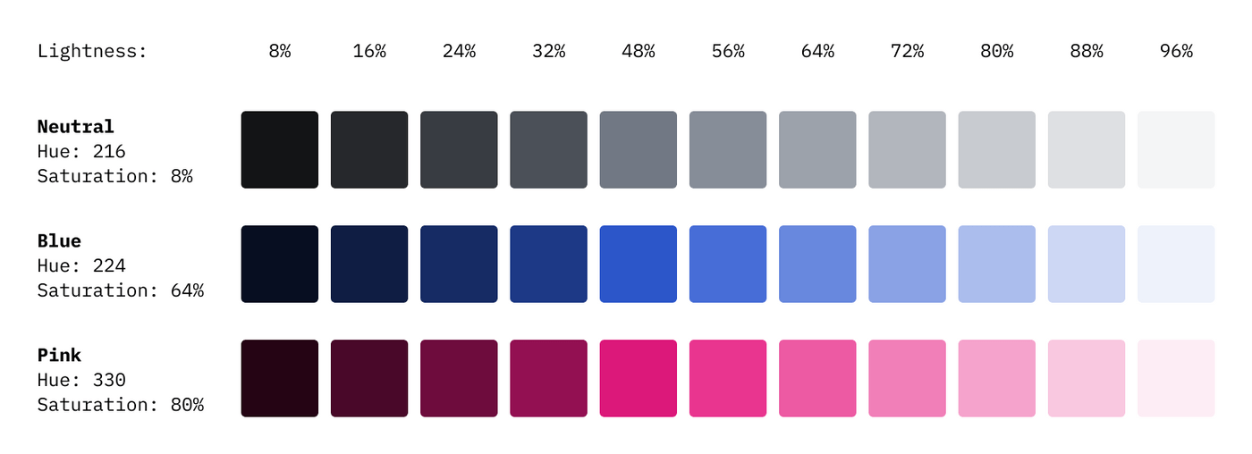
Fixed Hue and Saturation
Keeping the hue and saturation and adjusting only the lightness is an easy way to maintain the colour tone while using various shades.

HSL function with styled-component
The function takes two parameters: Colour name (string) and Lightness (number). The colour name is replaced with predetermined Hue and Saturation values, and the lightness is used as the given value. So basically the function returns CSS HSL value.
export const hsl = (color: string, lightness: number) => {let hs: stringswitch (color) {case 'neutral':hs = '216, 8%'breakcase 'blue':hs = '224, 64%'breakcase 'pink':hs = '330, 80%'breakdefault:break}return `hsl(${hs}, ${lightness}%)`}
Use this function with styled-components:
import styled from 'styled-components'import { hsl } from 'src/styles'const BlueButton = styled.button`color: ${hsl('blue', 96)};background-color: ${hsl('blue', 32)};&:hover {background-color: ${hsl('blue', 48)};}`
The functions return CSS HSL colour values.
button {color: hsl(224, 64%, 96%);background-color: hsl(224, 64%, 32%);}button:hover {background-color: hsl(224, 64%, 48%);}